Typography is a crucial element in digital design, playing a vital role in communicating messages and setting the tone for a brand. Good typography enhances the readability and legibility of the text, creates a visual hierarchy, builds brand recognition, shows personality, makes an impact, establishes mood and tone, and draws attention to important messages. It is an essential skill for graphic and web designers to master in order to create effective and engaging designs.
Typography is not just about selecting fonts and typefaces; it is an art that involves arranging letters and text to make it legible, clear, and visually appealing. It has a long history, dating back to the 11th century with the invention of movable type. In modern digital design, typography is widely used in both web and graphic design, playing a crucial role in conveying messages and creating visually appealing designs.
Key Takeaways:
- Typography is a crucial element in digital design, enhancing readability and legibility.
- Good typography establishes visual hierarchy and builds brand recognition.
- Typography plays a key role in conveying personality, making an impact, and setting mood and tone.
- Designers should master typography to create effective and engaging designs.
- Typography has a long history and is widely used in both web and graphic design.
The Basics of Typography
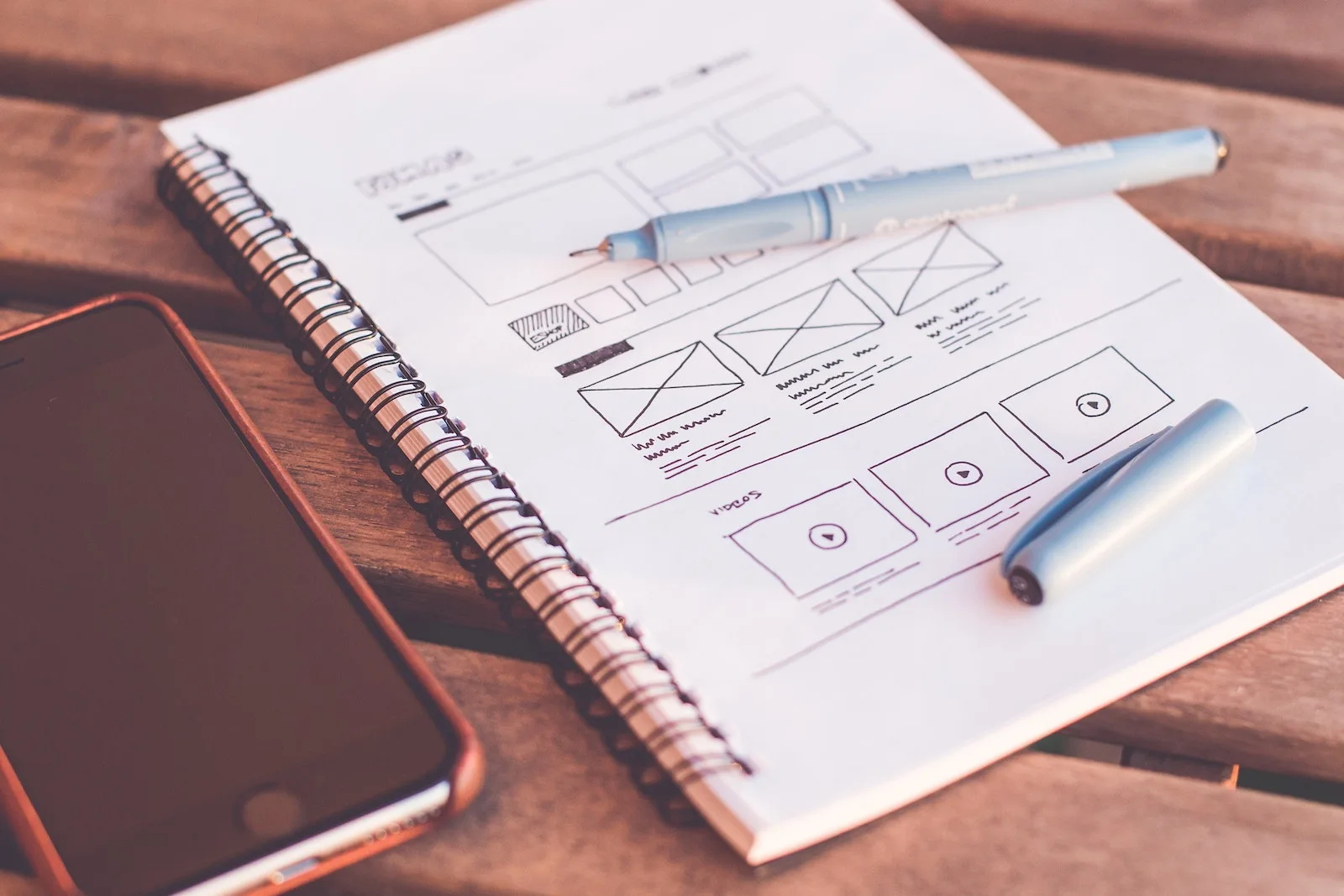
Typography is the art of arranging letters and text to make it legible, clear, and visually appealing. It is a fundamental element in both web and graphic design, playing a crucial role in creating effective and engaging designs. The history of typography dates back to the 11th century with the invention of movable type, and it has since evolved to become an essential skill for designers.
In web design, typography is used to enhance the readability and user experience of a website. It involves choosing the right typeface, size, and spacing to ensure that the text is easily readable on various devices and screen sizes. Good typography can also create a visual hierarchy that guides the user’s eye and highlights important elements on the page.
In graphic design, typography is used to communicate the message and set the tone for a brand. It is an integral part of branding and can help establish brand recognition and personality. Graphic designers use different typefaces, font styles, and layouts to convey emotions, convey information, and create a visual impact.
| Type of Design | Example |
|---|---|
| Web Design | |
| Graphic Design |
The Elements of Typography
When it comes to choosing the right typography for digital design, there are several key elements to consider. These elements play a crucial role in creating effective and visually appealing designs. Let’s take a closer look at each of them:
Fonts and Typefaces
The choice of fonts and typefaces sets the tone for your design. It is important to select typefaces that align with your brand’s personality and values. Serif fonts are often associated with elegance and tradition, while sans-serif fonts convey a modern and minimalist feel. Experiment with different typefaces to find the one that best represents your brand.
Contrast
Contrast is used to create visual interest and emphasize important elements in your design. By using contrasting font styles, sizes, or colors, you can draw the viewer’s attention to specific messages or sections of your design. However, be cautious not to overuse contrast, as it can make your design look cluttered and chaotic.
Consistency
Consistency is key in typography. It ensures that your design has a unified and cohesive look. Use consistent font styles, sizes, and spacing throughout your design to create a professional and polished appearance. Consistency also contributes to readability and allows the viewer to easily navigate through the content.
White Space
White space, also known as negative space, refers to the empty areas surrounding your text. It provides breathing room and enhances readability by giving the eyes a rest. Incorporating white space into your design helps to create a clean and balanced layout, making it easier for the viewer to absorb the information.
Alignment
Alignment helps to create a sense of order and structure in your design. Whether you choose to align your text to the left, right, center, or justified, it is important to maintain consistency throughout your design. Alignment ensures that your text is visually appealing and easy to read.
Color
Color can add visual impact to your typography. It can evoke emotions and convey meaning. Consider the overall color scheme of your design and choose colors that complement each other. Use color selectively and purposefully to guide the viewer’s eye and emphasize important elements.
Hierarchy
Hierarchy establishes a visual order in your design. It guides the viewer’s eye through the content and highlights important messages. By varying font sizes, weights, or styles, you can create a clear hierarchy and ensure that the most important information stands out. A well-designed hierarchy enhances readability and improves the overall user experience.
| Element | Description |
|---|---|
| Fonts and Typefaces | The style and design of the letters used in the design. |
| Contrast | The use of differences in font styles, sizes, or colors to create visual interest. |
| Consistency | The use of consistent font styles, sizes, and spacing throughout the design. |
| White Space | The empty areas surrounding the text, providing breathing room and enhancing readability. |
| Alignment | The positioning of the text, creating a sense of order and structure. |
| Color | The use of color to add visual impact and convey emotions. |
| Hierarchy | The establishment of a visual order, guiding the viewer’s eye and highlighting important messages. |
By considering these elements and applying them effectively, you can choose the right typography for your digital designs and create visually appealing and impactful designs.

Choosing the Right Typeface for Your Design
Typography trends in digital design are constantly evolving, and selecting the right typeface is essential to enhance the user experience and convey the intended message. With the wide range of typefaces available today, designers have the freedom to experiment and choose fonts that align with the brand’s values and personality.
One of the key considerations when selecting a typeface is to stay updated with current typography trends. This allows designers to create designs that feel fresh and modern. Whether it’s a display font for a bold headline or a serif font for a classic look, being aware of the latest trends in typography can help designers create visually appealing and engaging designs.
Legibility and readability are also important factors when choosing a typeface for digital design. The typeface should be easy to read, even in different sizes and on various devices. It is crucial to consider the target audience and ensure that the chosen typeface is legible for them. Additionally, designers should pay attention to the spacing between letters and make sure that it doesn’t hinder readability or create visual confusion.
Another aspect to consider is the compatibility of the typeface with different devices and platforms. A typeface that looks great on a desktop screen may not translate well on a mobile device. Designers should test how the typeface renders on different devices and ensure that it maintains its visual appeal and legibility across all platforms.
The Impact of Typography Trends in Digital Design
The right typeface can have a significant impact on the overall design and user experience. Typography trends play a crucial role in establishing a visual identity and creating a memorable brand presence. When used effectively, typography can enhance the visual storytelling and draw the user’s attention to key messages and calls-to-action.
By staying up-to-date with typography trends, designers can leverage the power of typography to create designs that resonate with the target audience and evoke specific emotions. Whether it’s a sleek and minimalistic sans-serif font or a playful and whimsical script font, the chosen typeface can set the tone and personality of the design.
In conclusion, the selection of the right typeface is a critical decision in digital design. It not only impacts the visual appeal of the design but also influences the user’s experience and perception of the brand. By considering current typography trends, focusing on legibility and compatibility, and aligning the typeface with the brand’s values, designers can create designs that captivate and engage their audience.
Table: Key Considerations when Choosing a Typeface
| Consideration | Description |
|---|---|
| Typography Trends | Stay updated with the latest typography trends to create designs that feel modern and fresh. |
| Legibility and Readability | Ensure that the chosen typeface is easy to read in different sizes and on various devices. |
| Target Audience | Consider the readability of the typeface for the intended audience. |
| Compatibility | Test how the typeface renders on different devices and platforms to maintain its visual appeal and legibility. |
Creating an Effective Typographical Hierarchy
Establishing a clear typographical hierarchy is crucial in digital design as it helps guide the viewer’s eye and effectively communicates the intended message. By employing different techniques such as size, weight, and spacing, designers can create contrast and emphasis within their designs.
When it comes to typography in digital design, legibility is of utmost importance. Headlines should stand out and draw attention, making use of larger font sizes and bold weights. A well-designed typographical hierarchy ensures that body text is comfortable to read, with appropriate font sizes and line spacing to enhance legibility.
In addition to size and weight, color can also play a significant role in creating an effective typographical hierarchy. By using bold and contrasting colors for headlines and more subdued tones for body text, designers can further draw attention to important elements while maintaining a cohesive visual aesthetic.
Using Lists to Optimize Typographical Hierarchy:
- Create an unordered list to present information in a concise and visually appealing manner.
- Use bullet points to highlight key points and make information easily scannable for readers.
- Ensure consistent spacing and alignment within the list to maintain a clean and organized appearance.
To summarize, a well-executed typographical hierarchy in digital design is essential for effective communication. By carefully considering factors such as size, weight, spacing, and color, designers can guide the viewer’s eye, highlight important elements, and enhance the overall legibility of their designs.
| Type | Size | Weight | Color |
|---|---|---|---|
| Headline | 24px | Bold | #000000 |
| Subheadline | 18px | Semi-Bold | #333333 |
| Body Text | 16px | Regular | #666666 |
| Call to Action | 20px | Bold | #ff0000 |
The Impact of Typography on Branding
When it comes to branding, typography plays a significant role in creating a strong and recognizable visual identity. The choice of typeface can convey the personality and values of a brand, while consistent use of typography across marketing materials helps build brand recognition. Typography has the power to evoke emotions and set the mood and tone of a brand, making it an essential element in brand design.
One way typography impacts branding is by establishing brand recognition. By selecting a unique and distinct typeface, a brand can create a visual language that is instantly recognizable to its audience. Think of iconic brands like Coca-Cola or Nike, whose logos have become synonymous with their respective fonts. Consistency in typography helps create a professional and cohesive brand identity, reinforcing brand recognition across various touchpoints.
Moreover, typography can effectively communicate a brand’s personality and values. Different typefaces have their own associations and connotations, whether it’s a sleek, modern font for a tech brand or a classic serif font for a luxury brand. By choosing the right typeface, a brand can create a visual representation of its desired image and connect with its target audience on a deeper level.
The Role of Typography in Branding
Table: Impact of Typography on Branding
| Aspect | Impact |
|---|---|
| Brand recognition | Creates a visual language for instant recognition |
| Personality and values | Conveys brand image and connects with the audience |
| Consistency | Builds a cohesive brand identity |
| Emotions and tone | Elicits specific feelings and sets the mood |
In conclusion, typography plays a crucial role in branding by establishing brand recognition, conveying personality and values, and creating a cohesive brand identity. Designers and marketers must carefully consider the choice of typeface and maintain consistency across all brand communications. By harnessing the power of typography, a brand can create a lasting impression and effectively communicate its message to the target audience.
Conclusion
Typography is an essential element in digital design, with a significant impact on the overall aesthetics and effectiveness of a design. It serves as a powerful tool in visually communicating the message, establishing brand recognition, and creating a memorable user experience. By understanding the importance of typography and applying its principles, designers can elevate their designs and make a lasting impression on viewers.
The choice of typeface, creating a typographical hierarchy, and ensuring legibility and readability are key factors in designing effective and engaging compositions. The right typeface can convey the brand’s personality and values, while a well-structured typographical hierarchy guides the viewer’s eye and highlights important elements. It is also crucial to consider the legibility and readability of the typography, ensuring that users can easily and comfortably consume the information presented.
With a deep understanding of typography and its impact on design, designers can effectively communicate their intended message, evoke desired emotions, and establish a consistent and recognizable brand identity. Typography is not merely a visual decorative element, but rather a fundamental aspect of digital design that should be carefully crafted and considered in every project. As designers continue to master the art of typography, they can create designs that are not only visually appealing but also informative, engaging, and memorable.
FAQ
What is the importance of typography in digital design?
Typography plays a vital role in communicating the message and setting the tone for a brand. It enhances readability and legibility, creates a visual hierarchy, builds brand recognition, shows personality, makes an impact, establishes mood and tone, and draws attention to important messages.
What does typography involve?
Typography involves font style, appearance, and structure. It encompasses the art of arranging letters and text to make it legible, clear, and visually appealing.
What are the key elements of typography?
The key elements of typography include fonts and typefaces, contrast, consistency, white space, alignment, color, and hierarchy.
How do you choose the right typeface for your design?
It is crucial to consider current typography trends and choose typefaces that align with the brand’s values and personality. Pairing different typefaces can create contrast and visual interest. Legibility and readability in digital formats should also be taken into account.
How do you create an effective typographical hierarchy?
Establishing a typographical hierarchy involves using size, weight, and spacing to create contrast and emphasis. It is important to consider legibility and readability when creating a hierarchy and ensuring consistency throughout the design.
How does typography impact branding?
Typography helps establish brand recognition and creates a consistent visual language. The choice of typeface can convey the brand’s personality and values, and consistent use of typography across marketing materials contributes to a professional and recognizable brand identity.